When you think of McDonald’s, what do you see? Most people think of the Golden Arches, first introduced in 1968, which has a distinctive yellow colour – #ffc300 to be precise!
Yellow and Red are very popular colours in the restaurant industry. This is not by accident. Colour therapists agree that the combination of yellow and red create the perfect emotional triggers for their target audience. Yellow triggers the feelings of happiness and friendliness. Red triggers stimulation, appetite, hunger; and it attracts attention.
Because of this, McDoanld’s spend a fortune on their brand and the colours are a big part if it. More recently you may have noticed that McDonald’s have omitted the red and now use green. This is because Green elicits the feelings of nature, natural and environmentally friendly, which helps promote McDoanld’s new marketing strategy of it being a place where you can relax and eat as oppose to rush in for a quick bite (they even offer free Wi-Fi in most stores).
The yellow has remained a consistent symbol of McDonald’s store fronts, packaging and advertising. With thousands of creative and printers working with them worldwide, knowing what colour values to use and when is important to maintain consistency.
Print and Onscreen
If you have worked on a computer, you would have seen the terms Hex, RGB, CMYK and Pantone (PMS) to describe colour values; but most people do not know what the difference is and when to use them.
The two basic colour type categories are:
- Print – Colour on the page is subtractive
- Onscreen (digital) – Colour on the page is additive
These are in separate categories because print and onscreen mediums render colour in different ways, so you wouldn’t use RGB on a printing press or use Pantones for a website. If you don’t understand, I’ll explain.
HEX (Hexadecimal Colour)
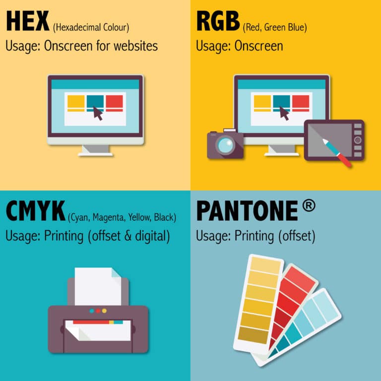
Usage: Onscreen for websites
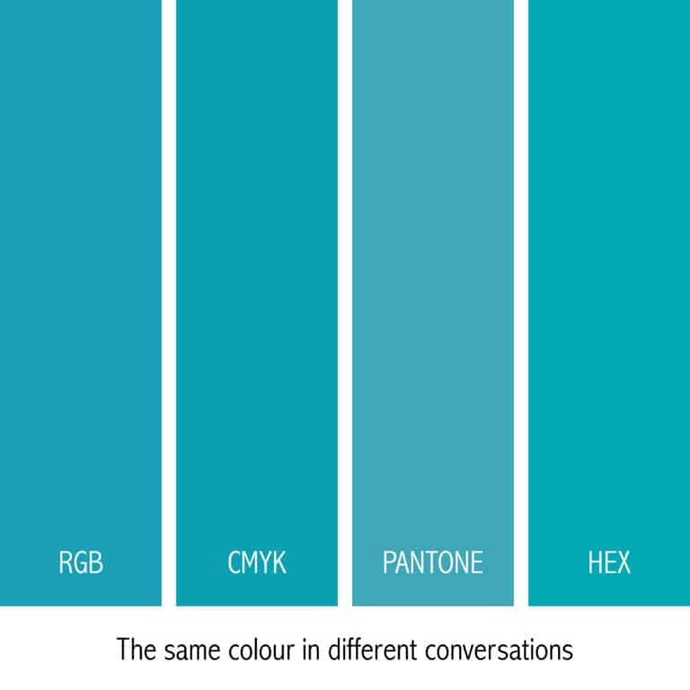
Example: #00A8B4
A Hex colour is expressed as a six digit combination of numbers and letters defined by its mix of red, green and blue (RGB). It is a shorthand for its RGB values with a little ‘conversion gymnastics’ in between. It is used by designers and developers for web design.
There are plenty of free conversion tools online. We recommend http://www.rgbtohex.net/
RGB (Red, Green, Blue)
Use: Onscreen
Example: R=25 G=168 B=180
RGB is the combination of Red, Green and Blue and is the process by which colours are rendered onscreen. It is 99.9% likely that your TV screen, mobile device and computer use the RGB colour profile.
The difference between RGB and CYMK (read more on CMYK below) is that it is an “additive” process. This means that when you use fully saturated versions of the three colours (red, green and blue), you get a pure white (R=255, G=255, B=255) and when you remove all three colours completely you get black (R=0, G=0, B=0)
Although RGB is found in the Microsoft Word colour palette (every designer’s NIGHTMARE!), RGB is specific to digital applications only. This includes mobile devices, computer monitors, laptops, TV and movie screens, games and illuminated signs.
Clients have sometimes complained when they have designed something in Microsoft Word, Powerpoint or our nemesis, Publisher because when printed it is less vibrant. RGB appears vibrant on the screen because it is illuminated and has a larger colour gamut than what you would get on a printed page.
CMYK (Cyan, Magenta, Yellow, Key/Black)
Use: Printing – Used in offset and digital printing. Ideal for full-colour brochures, flyers, posters and post cards, etc.
Example: C= 78, Y= 18, M= 26 K= 0
Widely used in digital print and design, CMYK (also called ‘Four-colour Process’) is actually a method whereby a combination of tiny transparent dots of four ink colours: cyan, magenta, yellow and black are printed. Different combinations of large and small CMYK transparent dots overlap each other to create a wide spectrum of colours.
The cyan, magenta, yellow and black inks absorb coloured light, which is why CMYK is a “subtractive” colour model. This is why CMYK is different to Pantone ink also. When you look at a CMYK printed piece through a magnifying glass, you can see a pattern of CMYK dots and how they overlap to make the final colour. Whereas a Pantone ink is one solid colour throughout.

Use: Printing – For offset printing only. Ideal for stationery. Often used in one or two-colour jobs. Also used as spot colours on premium brochures in addition to four-colour process.
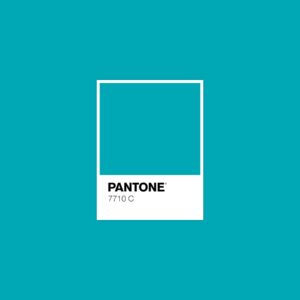
Example: PMS 7710
Pantone colours are standardised colour inks which are patented and made by the Pantone company. Pantone LLC as a company has been around for over 50 years and they are responsible for the creation of the first comprehensive standardised system of creating and matching colours in the graphic community.
There are over 1800 colours in their Formula Guide and it is sold to printers in either premixed or as a formula that can be mixed by using their base colours.
Recently, Pantone has been expanding their colour matching system to include fashion, plastics and lifestyle products. Every December designers and creatives eagerly await the Pantone of the Year and the photo campaign, then you see many blogs pop up with inspiring ways to use it.
This standardisation means most businesses and organisations use PMS colours for their branding, especially logos, to ensure the strictest colour consistency across different print products and across the globe.
Making the conversions between colour types RGB to CMYK
RGB to CMYK
Some applications (like the Microsoft ones) do not allow you to convert RGB to CMYK, so printers rely on the digital printer to do it. Every device has a very specific colour gamut so the output does vary.
Applications like Adobe Illustrator and Photoshop do allow you to make the conversation before outputting and this is advisable before supplying to a printer, especially if you are supplying a PDF file. Although most designers keep screen to print conversation in mind, it is important to note that there will be a colour difference in the finished product.
PMS to CMYK
Pantones can be converted to CMYK and vice versa, in applications such as Adobe Illustrator and Photoshop. However, most designers will ask you to select the colour from a swatch guide as it will be the most accurate representation.
RGB to HEX
Most design related applications and programs have a conversation functionality, or there are many online conversion tools. We recommend http://www.rgbtohex.net/ or you can follow the Wiki guidance on how to do the conversion yourself (if you like that sort of thing).
Need a quick reference on colour types? Here’s a handy graphic to refer to:


