
In the print industry, some level of colour variation is normal and expected. This applies whether you’re comparing a print to what you see on a screen, a previous print run, or a print from another supplier. While we take every step to ensure the closest possible match, factors like printing technology, materials, and colour modes mean that absolute consistency cannot always be guaranteed.
Why Do Colours Vary?
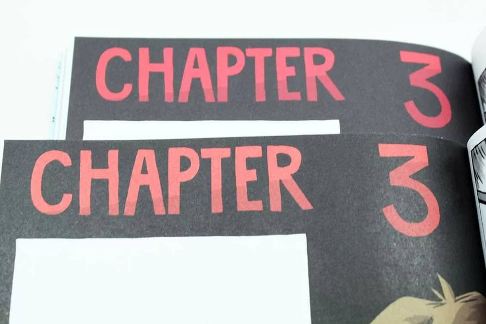
Reprints vs. Previous Orders
Even if we print the same artwork using the same settings, slight differences can still occur. This is due to factors such as:
- Toner and ink batches – Different batches of toner or ink can result in minor shifts in colour.
- Machine calibration – Printers require frequent calibration, and small adjustments can affect output.
- Environmental conditions – Factors like temperature and humidity can subtly impact the printing process.
If colour consistency is critical, let us know before production so we can discuss the best approach.
Differences Between Printers & Suppliers
A print from one supplier may not match exactly with a print from another because:
- Different printers use different machines, toners, inks, and colour profiles.
- Print processes and finishing methods can impact colour appearance.
Digital vs. Print Colours
When viewing artwork on a computer or phone screen, colours are displayed in RGB (Red, Green, Blue), which is light-based and can create highly vibrant colours. Printing, however, uses CMYK (Cyan, Magenta, Yellow, Black) or other print processes, which have a smaller colour range.
This means that:
- Some bright or vivid RGB colours cannot be reproduced in CMYK or print-based processes.
- What you see on screen may not match what is printed.
- Different screens (phones, laptops, desktops) may display the same colour differently, adding another layer of variance.
Setting Up Artwork Correctly
If artwork is set up in RGB instead of CMYK, the colours will automatically be converted during printing—but this can cause unexpected shifts in appearance. To get the best colour accuracy, artwork should always be supplied in CMYK format. If you’re unsure how to do this, we’re happy to help or provide guidance.
Material & Print Method Variations
Colours can also appear differently depending on:
- Material type – Glossy, matte, uncoated, fabric, vinyl, and other materials absorb toner or ink differently, which affects colour appearance.
- Lamination or coating – Matte coatings tend to mute colours, while gloss coatings can enhance vibrancy.
- Printing method – Digital, litho, screen printing, and large-format printing all produce different results.
Can I Get an Exact Colour Match?
Pantone (PMS) Colour Matching
If exact colour accuracy is critical, Pantone (PMS) colour matching may be an option. However, it’s important to understand that Pantone printing is a completely different process:
- Pantone inks are pre-mixed and standardised, offering better consistency than CMYK.
- Pantone is only available for litho printing, which is not cost-effective or available for small print runs.
- If you need a short run, such as 100 prints, CMYK or digital printing will be the best option, as Pantone requires printing in large quantities to be viable.
Does Colour Accuracy Really Matter?
Clients sometimes believe that colour matching is critical, but in most cases, small variations are completely unnoticeable in real-world situations.
For example, I was recently in Wagamama, sitting at a table with a friend. We both had the same printed menu in front of us, each with a strong red border. When I looked closely, I realised that my red border was completely different from my friend’s—a noticeable colour variation between two otherwise identical menus.
Did it matter? Not at all.
Did either of us question whether Wagamama had used the ‘correct’ red? No.
Wagamama’s goal was to print nice-looking menus, and that goal was achieved. If they had spent extra money on Pantone matching their red across thousands of menus, it would have been completely unnecessary—a waste of time and cost.
Most businesses don’t need Pantone printing because CMYK already provides more than sufficient accuracy at a much lower cost. If you’re unsure whether Pantone is necessary for your job, we’re happy to advise.
Providing a Sample for Colour Matching
If you have a previous print you’d like us to match as closely as possible, sending us a physical sample can help. However, it’s important to note:
- We will match the colour as closely as possible within the limitations of printing methods, materials, and processes.
- A 100% match cannot be guaranteed, but we will do our best within these restrictions.
Final Thoughts
We work hard to minimise colour variance, but some level of variation is an unavoidable part of printing. If you have any concerns or need to ensure colours are as close as possible, please reach out before placing your order, and we’ll discuss the best approach for your specific needs.
If you have any questions, let’s talk! We’re happy to help.